October 2019 W3: The Equipment System
I'm somewhat surprised to note that the weekly blog post is one of the most difficult and stressful parts of development. If I had to hazard a guess why, it's likely because it's front facing. This blog is/will be a gallery of my challenges and progress, as well as my evolving knowledge and understanding of game development in general. It's a sort of vulnerability in and of itself, and that makes it difficult to do.
On the flip side though, this does mean that the development work is easier than writing a blog, which is funny in a sort of dry way.
On the flip side though, this does mean that the development work is easier than writing a blog, which is funny in a sort of dry way.
Oct 21-25 Week 3 Update - The Equipment System (And minor UI tweaks)
This week has been a somewhat odd week, simply because I had my final shift at a bar job on Wednesday night, which ate into my available time Wednesday afternoon and the following morning. I was worried I wouldn't be able to meet the deadline, and thus would have to admit I'd bitten off more than I could chew in a single week. Happily, that wasn't an issue as I managed to complete the assigned feature of the week with 3 hours left to spare on Friday afternoon.
Primary Achievement
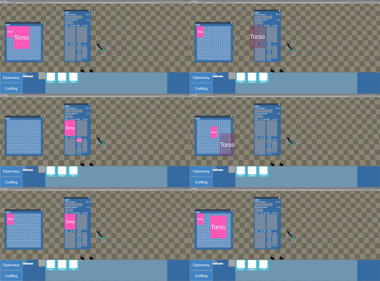
As is now tradition (via a single post) I'll start with a gif of the primary feature, equipment:
 |
| Equipping items onto a character |
This system is quite blasé, for the simple fact that it's almost everywhere. However, it marks an important step towards making items and characters interact, and specifically giving items more of a use than an oversized paperweight in one's inventory.
The Challenges
This system posed a particularly personal challenge - UI. I find UI to be rather fiddly and dull. It's less concrete than code, it doesn't just work or not. UI is based on different people's preferences and is very much an art form. I limited myself with this system to only making a functional and passable UI, as to not dwell so much on ideal placements and sizes that I lose track of my weekly goal.
The secondary challenge was once again code maintainability, which I struggled with on this system. I may need to consider a future refactor of how the inventory and equipment systems handle items in future, to increase its readability and maintainability for future me.
Secondary Achievements
This week also brought in a slew of UI quality of life features (Which are honestly my favourite part of this week).
 |
| Mysterious items are out, tool tips are in! |
 |
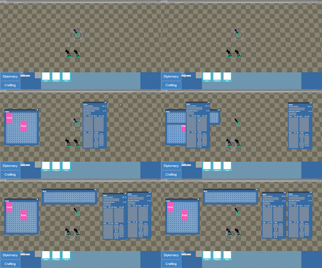
| Inventories and equipment windows are now instances, so you can cover your screen in them |
 |
| Added a selection info panel, which also holds functions relevant to the selected entity |
 |
| Window focus & pinning, my personal favourite because I have a weird affinity for UI management in games |
These four are relatively minor features in themselves, but pave the way for more elaborate and complex uses of them. Tool tips particularly can now be added to any potentially confusing UI elements, or to give entities a 'slightly-more-than-glance' value.
Considering how relatively easy the window focus and pinning was to implement, I'm really quite surprised that more games don't implement this. I think UI management and customisation is a sorely underutilised feature set, especially for menu heavy games such as strategy. A friend commented that I'm likely just too spoiled by my days of playing EVE Online. Probably one of the best customisable interfaces I've ever had the pleasure of using.
Otherwise, that's all for week 3, while I had originally planned to do the medical system in week 4, I have instead decided to build the stats and skills for the characters in order to hook equipped items' stats into the characters, and as a prerequisite for implementing XP gain on new behaviours such as attacking, or taking damage.


Comments
Post a Comment