November 2019 W2: Crafting UI and Design
I want to take a step in a different direction for this post. Most of this week has been tedious background work getting the subtypes fully up and running, and it's felt like an incredibly long week compared to the others.
The good news of course is that the subtypes work correctly, and they have skills and bonuses assigned to them ready to be utilised for an attack action. Other than that, the only thing of particular note that I completed was an overhaul of the crafting UI, both functionally and aesthetically.
The overhaul, or rather the design process of said overhaul, is what I specifically want to talk about in this post, but I'll get into that after I show off the achievements of this week...
Achievements
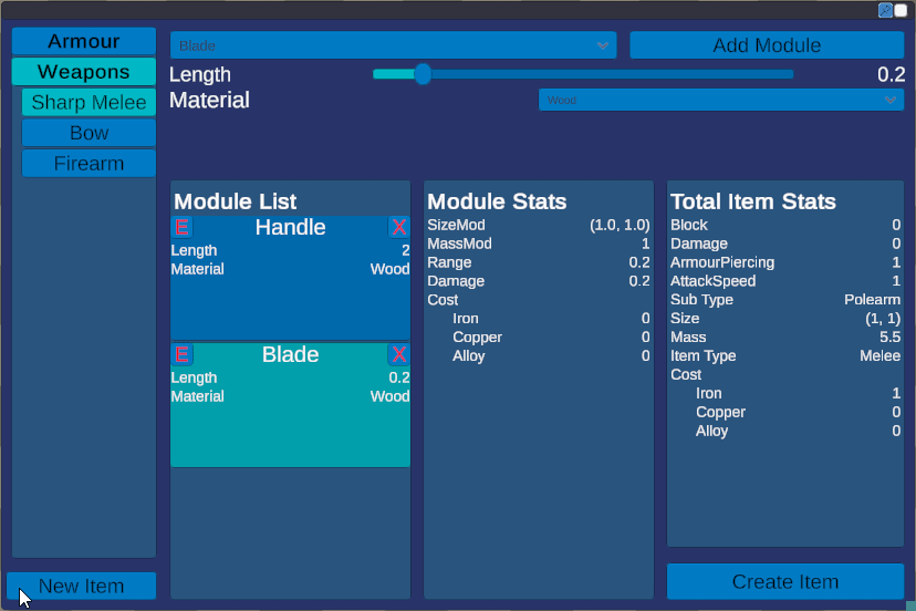
The first is the UI overhaul, which I am honestly most proud of. The new UI is more space efficient, more functional, easier to use, and far more beautiful. Here's a screenshot of it, and you can make up your own mind (Though I very much welcome constructive feedback!):
 |
| The new 'chad' UI |
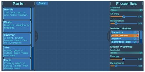
For reference, below is the old UI, in all it's glory, or lack thereof.
 |
| The old 'virgin' UI |
I'm honestly pretty damn happy with the new UI. I was looking for a way to make it more intuitive and functional for a while, and this week I used a new method that turned out to be just the kick I needed for design.
More on the design later, for now there's the second (and 'main') achievement of this week: crafting subtypes. If you don't recall from last week's post, subtypes are types assigned to equipment based on the modules put on it and their values. For example, a melee weapon with a short handle and a longer blade is a sword.
The subtype inherently confers boons and mali based on the weapon type and user's skill with said weapon type. For example, polearms are flagged as being incredibly ineffective indoors, where there isn't enough space to effectively swing them.
Below is a gif of the subtypes in action. It isn't much visually, but nonetheless it's an interesting accomplishment.
 |
| Creating a quarterstaff, a sword, and then a polearm with different module values |
Following on from this is my second favourite feature of the week, the ability to edit existing modules on items in real time without having to delete and re-add them. This is also why the "New Module" button was dropped, as creating and adding modules is now one step!
 |
| Editing existing modules |
Design
I mentioned I had quite a struggle coming up with a new design for the UI, both functionally and aesthetically prior to this week. I had tried multiple design tools, as well as using paint, and photoshop to attempt and map out a rough UI design.
Unfortunately I found that while using these software, they were just unintuitive enough for the purpose that I couldn't grasp my inspiration, and actually design the UI.
Skip forward to this week, where I was gifted a brand new, old Wacom Bamboo drawing tablet by a friend who had never used it (Thanks Lyc!). The purpose I intended it for initially was indeed mock UI designs, as I had an inkling it would help, and help it did.
The idea that a drawing tablet just suddenly gave me the ability to mock up UI designs when there are far more targeted solutions out there may seem odd, and I'll give you that, it probably is odd. But! The ability to draw freehand on an easily erasable, clean surface has in the past been incredibly useful for my brain storming.
I currently have a quite large whiteboard attached to my wall where I keep things from reminders, to Solaris name ideas, to a work schedule. I also use the white board for brainstorming solutions to programming problems. I draw flow charts and quickly sketch out how I can achieve what I want to in the most human readable, maintainable, and efficient way possible.
This is essentially what I wanted to get out of the drawing tablet, except with the added versatility of a digital platform and software such as photoshop.
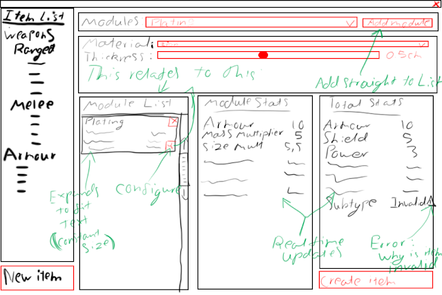
This was the UI design I came up with:

I had a clear system in mind: black is normal elements, red are interactable elements, and green are the overlaid annotations. This mockup became what you saw above, and was pretty easy to translate into Unity considering I had the mockup available as a reference image. The annotations kept me on track in terms of functionality as well, and very few things changed from the original. I think just about the only thing that did change was the location of the edit button, from the bottom right where it could be easily missed for the below module's delete button, to the top left.
Next Week
I've been struggling with productivity this week, and I believe it's because I'm currently extremely motivated to do artistic work. I really really want to research procedural mesh generation, and do some more 3D modelling, as I hardly get time outside of work to do these things.
In an effort to both up productivity, marketability, and enjoyment, I'm going to take one to two weeks to do a graphical overhaul of the game. Update all the UI to the new colour scheme, make some models, do some shader research, and some procedural mesh generation research.
Hopefully after that, I'll have some nice shiny material to post!

Comments
Post a Comment